Overlay Button
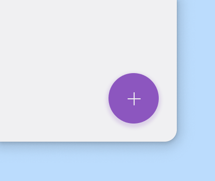
Use a Overlay Button for the most important action on a Window. The Overlay Button appears in front of all other content on Window, and is recognizable for its circle shape and icon in the center. Only use a Overlay Button for presenting a Window's primary action. The Overlay Button can be aligned left, center, or right.
There are 3 sizes of Overlay Buttons, Normal being the default:
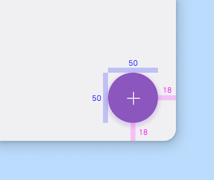
- Normal (50×50px, icon: 24px)
- Small (34×34px, icon: 16px)
- Large (90×90px, icon: 32px)
Geometry
The Overlay Button is typically shown in a circle container, and the coloring of its background should be the app's accent color, and should contrast well with the background.
- It should by default be spaced 18px from all sides.
- Don't layer things on top of a Overlay Button.
- Ensure that the Overlay Button contrasts very well with the area behind it.
An icon in an Overlay Button should be understandable and clear. On hover, Overlay Buttons should display a tooltip showing what it does in one or 3 words maximum. It shouldn't contain notifications or actions seen elsewhere.
- Use clear and simple icons, such as
list-add-symbolic,chat-message-new-symbolic, ordocument-edit-symbolic. Ensure that a tooltip is available for clarity. - Don't use confusing or open-ended icons that suggest less common actions.
An Overlay Button can trigger an action either on the current Window, or it can perform an action that creates a new Window. It promotes an important, constructive action such as:
- Create
- Favorite
- Share
- Start a process

Small Overlay Button
This type of Overlay Button is used for secondary, supporting actions.
- If multiple important actions are necessary, use a small Overlay Button for those.
- Don't use multiple normal-sized Overlay Buttons as they might compete for attention.
Large Overlay Button
This type of Overlay Button is used when the layout calls for a prominent action, when a larger footprint would aid in user engagement.
- Don’t use an Overlay Button in a non-scrolling view, use a Button instead.
- Consider a large Overlay Button when there's a clear action to do in the user flow.
- Don't use a large Overlay Button if it will hide important UI when scrolling. Instead use a normal sized Overlay Button.
Textual Overlay Button
This type of Overlay Button can be more effective where an icon alone might be too ambiguous in the View.
- Don’t use a Textual Overlay Button in a non-scrolling view.
- If a primary action is needed in a non-scrolling View, use a Button instead.