Dialog

Dialogs interrupt users with urgent information, details, or actions. Common usage includes confirming a destructive action, or informing the user of something instantly.
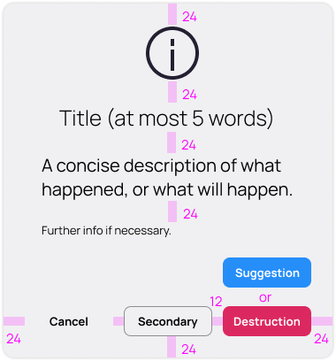
A dialog should not exceed 400 units in width and height.
A dialog is modal with the Window, and displays a scrim behind it.
A dialog fades in, and scales up from 80% to 100% (its final size.) A background scrim fades in, in front of app content.
A dialog stays in focus and does not scroll until the user has dismissed or gone through with its associated confirmation.
A dialog should not contain, or make happen, scrollable contents.
Remember these extra guidances as well for messaging in dialogs:
Say what happened — Make it clear what did/didn’t happen. Explain why the user got this error, even if the only explanation is technical.
Provide reassurance — Where possible, let them know what was not affected by the error.
Be empathetic — Still use “please” if the situation warrants it. Maybe it’s a really dire situation, so empathize.
Help them fix it — Tell them exactly what to do if there’s a way to possibly fix it.
Always give a way out — If they can’t fix the problem, provide them with a way to contact.