App Icon
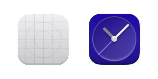
An app's icon should showcase what your app does as simple as possible. It should capture the essence of the app's function using only geometric shapes.
HIG Compliant app icons have some rules to abide by, so they're the best they can be:
- 128×128px canvas size to allow for uniqueness of shape and consistency of visual geometry. We recommend that details are at least 4px in either width or height to allow the best appearance possible if the icon is smaller.
- Slight bottom-up perspective; this makes part of the front face to show.
- This front face is shaded darker than the top surface, and should by default be 4px tall.
- Shadows should be avoided if possible, but can be used if it is necessary to give contrast to different icon elements.
- Shapes with slight transparency (no more than 20% transparent) if needed.
Once your icon is made, then it can be shipped with your app.
Important: Use the palette below to make your app icons.
