Buttons
The Button is the main component enabling users to interact with your app. Each View should contain at least one prominent button for the primary action. This button should command the most attention from the user. The arrangement of other buttons in the View should show that this one is the most important action. The button is always spaced by 12 units in any direction.
An app can show more buttons in a View in other places, but be sure that one button doesn't clash with the other button's attention. A button's level of emphasis determines its looks, typography, and placement in the layout. Use a combination of button styles to drive the user focus to the primary action, while offering alternative routes to take. The buttons cannot be stacked vertically.
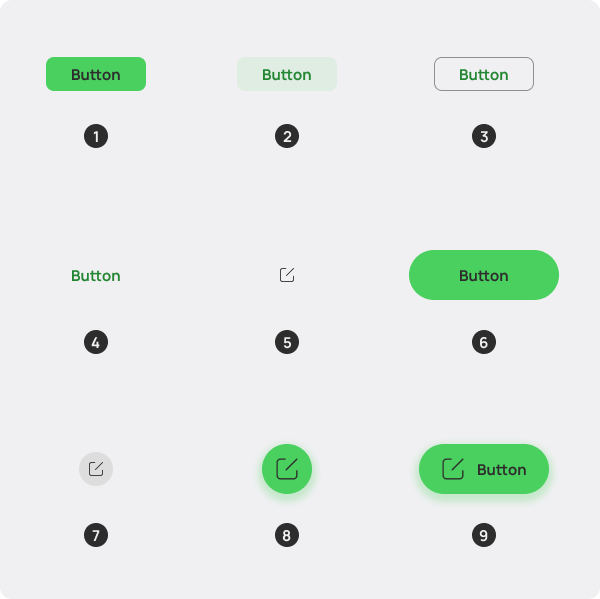
When using multiple buttons, you should indicate hierarchy of actions by placing a fill button (1) next to a text button (4) or an outline button (3). This combination can also be fulfilled with an outline button next to a text button. Use a filled button on its own when there's no alternatives and a single important action.
Fill Button
The default button, its background is a strong accented color, and the text makes up the proper contrast to the background (if you're using the Helium Color CSS Classes.)
Tint Button
This button sports a faded background that is transparent. It's useful for when you want to preserve seeing the background behind it.
Outline Button
This button serves a mid-emphasis action, while functioning similar to the fill button.
Text Button
This button serves a low-emphasis action, while functioning similar to the fill button.
Iconic Button
Reserved for App Bars and Bottom Bars, this button employs an icon, and a required tooltip showing what the button does in Sentence Case.
Pill Button
This is a fill button that's suited for Welcome Screens and Content Blocks. It's big enough to draw attention, so exercise caution in overusing it.
Disclosure Button
This is a button best paired to a View Title, and should not be used in the content area of a View. It's circular and colorless, and is suited for actions that configure a View.
Overlay Button
This button overlays the content, and is best suited for the single most important action. Use it only when the View is scrollable.
Textual Overlay Button
This button also overlays the content, and its large footprint makes it useful for the prominent action in a View, in which an icon is too ambiguous to discern the action purpose alone, so it accompanies a label of up to 2 words.